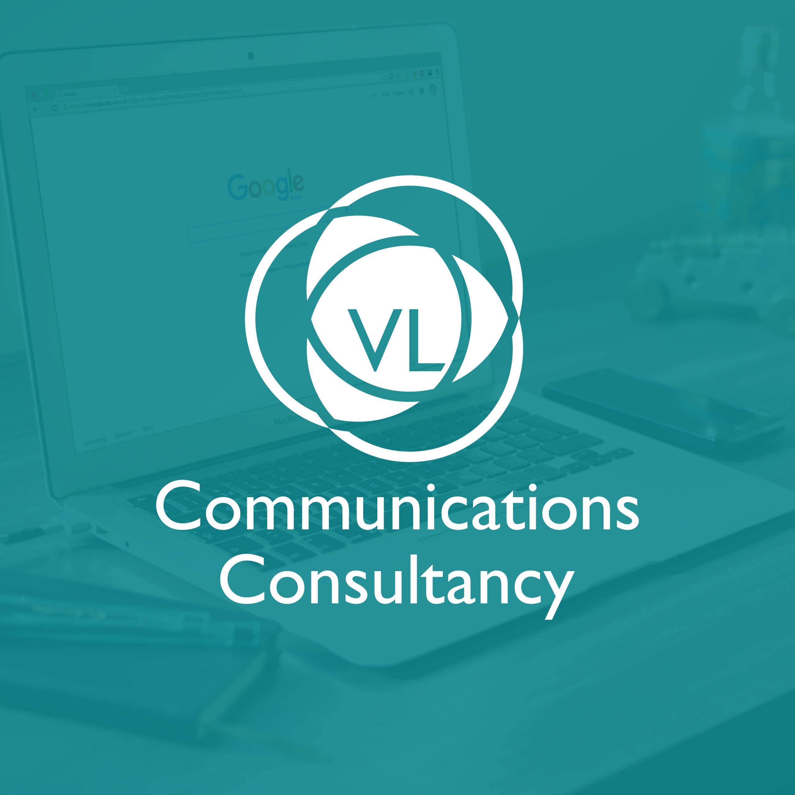
Being a PR Agency, the narrative that we really wanted to capture with VL Communication’s new branding was the link between them, the client and the public.
We toyed with a selection of sketches but both were drawn to this chain of three circles.

I brought the design into a grid and increased the stroke size of the rings to give them more prominence. Then I set about scaling each element to compliment each other along with a stronger colour scheme.

To help Victoria visualise the final design, I mocked up the logo on to a few in-situ pieces of merchandise.